 Built on Bubble
Built on Bubble
Built on Bubble

| Style | Best for | Signature behavior |
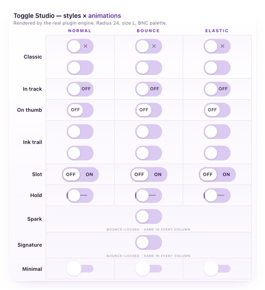
| Hold | Critical actions (delete, deploy, send) | The user presses and holds to confirm; releasing early cancels. A progress fill sweeps the track. Turning off is always instant. |
| Classic | Default, every interface | A refined pill with optional check and cross cues inside the track. |
| In track | Always-visible static label | A label sits in the rail’s free zone, opposite the thumb. |
| On thumb | Single-letter labels (EN/FR, AM/PM) | A label rides the moving thumb, capped at 3 characters. |
| Ink trail | Modern, expressive interfaces | A colored streak diffuses behind the thumb, and an ON/OFF label appears and fades with it, so the state always reads at a glance. |
| Slot | Segmented choices (dark/light, YES/NO) | Both options visible side by side with a sliding highlight. |
| Spark | A celebratory switch-on moment | On switch-on, a comet orbits the rail once then fades, in a color you choose. Turning off is instant, with no effect. |
| Signature | A calling-card moment | A liquid drop crawls across the track, then a halo blooms at the landing point in a color you choose. |
| Minimal | Austere, dense interfaces | A plain switch with no cues or ornament. |

| Feature | Bubble Checkbox | Toggle Studio & Hold |
| Distinct visual styles | 1 | 9 |
| Hold-to-confirm for critical actions | ❌ | ✅ |
| Per-style customization (colors, sizes, radius, labels, icons, timing) | Limited | ✅ |
| Element actions (Set state, Toggle, Reset) | ❌ | ✅ |
| Screen-reader switch role (not checkbox) | ❌ | ✅ |
| Reduced-motion support | ❌ | ✅ |
| Zero external dependencies | ✅ | ✅ |

| Name | Provider / Domain | Expiration | Description |
|---|---|---|---|
| usprivacy | .bubble.io | 1 year | This cookie stores the user's consent state regarding tracking and privacy in compliance with the United States privacy regulation. |
| __cf_bm | .calendly.com | 29 minutes 45 seconds | This cookie is used to distinguish between humans and bots. This is beneficial for the website, in order to make valid reports on the use of their website. |
| __cf_bm | .clutch.co | 29 minutes 55 seconds | This cookie is used to distinguish between humans and bots. This is beneficial for the website, in order to make valid reports on the use of their website. |
| li_gc | .linkedin.com | 5 months 4 weeks | Used to store guest consent to the use of cookies for non-essential purposes |
| __cf_bm | .transformo.io | 29 minutes 57 seconds | This cookie is used to distinguish between humans and bots. This is beneficial for the website, in order to make valid reports on the use of their website. |
| meta_u1main | .bubble.io | Session | |
| __cf_bm | .lu.ma | 29 minutes 44 seconds | This cookie is used to distinguish between humans and bots. This is beneficial for the website, in order to make valid reports on the use of their website. |
| meta_live_u2main.sig | .bubble.io | 2 days 23 hours | |
| _GRECAPTCHA | www.google.com | 5 months 4 weeks | Google reCAPTCHA sets a necessary cookie (_GRECAPTCHA) when executed for the purpose of providing its risk analysis. |
| __cf_bm | .producthunt.com | 29 minutes 57 seconds | This cookie is used to distinguish between humans and bots. This is beneficial for the website, in order to make valid reports on the use of their website. |
| _GRECAPTCHA | www.recaptcha.net | 5 months 4 weeks | Google reCAPTCHA sets a necessary cookie (_GRECAPTCHA) when executed for the purpose of providing its risk analysis. |
| _gd_session | bubble.io | 4 hours | This cookie manages user sessions on the website, ensuring that user interactions are recognized across various web requests. This helps in providing a consistent and accurate user experience. |
| _scid | .bubble.io | 1 year 1 month | |
| opt_out | .postrelease.com | 1 year | This cookie is used to track the user's decision to opt out of cookies on the website, indicating they have chosen not to have their data used for tracking and personalisation purposes. |
| AWSALBCORS | storm.birdie.so | 6 days 23 hours | For continued stickiness support with CORS use cases after the Chromium update, we are creating additional stickiness cookies for each of these duration-based stickiness features named AWSALBCORS (ALB). |
| VISITOR_PRIVACY_METADATA | .youtube.com | 5 months 4 weeks | This cookie is used to store the user's consent and privacy choices for their interaction with the site. It records data on the visitor's consent regarding various privacy policies and settings, ensuring that their preferences are honored in future sessions. |
| __cf_bm | .lumacdn.com | 29 minutes 58 seconds | This cookie is used to distinguish between humans and bots. This is beneficial for the website, in order to make valid reports on the use of their website. |
| _tt_enable_cookie | .bubble.io | 2 months 4 weeks | This cookie is used to remember the user's preferences regarding the use of cookies on the website. |
| AWSALBCORS | app.birdie.so | 1 week | For continued stickiness support with CORS use cases after the Chromium update, we are creating additional stickiness cookies for each of these duration-based stickiness features named AWSALBCORS (ALB). |
| __cf_bm | .t.co | 29 minutes 44 seconds | This cookie is used to distinguish between humans and bots. This is beneficial for the website, in order to make valid reports on the use of their website. |
| __cf_bm | .twitter.com | 29 minutes 44 seconds | This cookie is used to distinguish between humans and bots. This is beneficial for the website, in order to make valid reports on the use of their website. |
| __cf_bm | .vimeo.com | 29 minutes 58 seconds | This cookie is used to distinguish between humans and bots. This is beneficial for the website, in order to make valid reports on the use of their website. |
| __session | .gitbook.com | 1 year 1 month | This cookie is used to maintain an anonymized user session by the server. |
| meta_live_u2main | .bubble.io | 2 days 23 hours | |
| CookieScriptConsent | .bubble.io | 1 year 1 month | This cookie is used by Cookie-Script.com service to remember visitor cookie consent preferences. It is necessary for Cookie-Script.com cookie banner to work properly. |
| meta-firebase_workflow | .bubble.io | 59 minutes 21 seconds |
| Name | Provider / Domain | Expiration | Description |
|---|---|---|---|
| X-AB | sc-static.net | 1 day | |
| _ga_G4MHXCYE4T | .bubble.io | 1 year 1 month | This cookie is used by Google Analytics to persist session state. |
| m | m.stripe.com | 1 year 1 month | This cookie is generally used for performance and optimization of payment processing services, facilitating caching of content on the browser to make pages load faster. |
| _ttp | .bubble.io | 2 months 4 weeks | This cookie is used to track user interaction and behavior on the website for site performance and usage analysis. This information is used to improve the user experience and optimize the website's functionality. |
| analytics_session_id | .bubble.io | 1 year | This cookie tracks user behavior throughout the session on the website, collecting data such as how long a visitor stays on a page and what links they click on. This information is used to improve user experience and website performance. |
| data-c | .media.net | 4 weeks 2 days | This cookie is used to collect information on user behavior and interaction to enhance the user experience and measure website performance. |
| _gd_visitor | bubble.io | 1 year 1 month | This cookie is used to track visitors' interactions with the website, collecting data on their behavior for analytics purposes. It helps in understanding how users engage with the site, which parts of the site are most visited, and how the navigation flow is structured, aiming to improve the user experience and site performance. |
| _ttp | .tiktok.com | 2 months 4 weeks | This cookie is used to track user interaction and behavior on the website for site performance and usage analysis. This information is used to improve the user experience and optimize the website's functionality. |
| analytics_session_id.last_access | .bubble.io | 1 year | This cookie is used to store the time of the last access by a user in an analytics session, helping in understanding user engagement and the effectiveness of the website content. |
| _ga_BFPVR2DEE2 | .bubble.io | 1 year 1 month | This cookie is used by Google Analytics to persist session state. |
| ahoy_visit | store.bubble.io | 4 hours | This cookie is used to track a visitor's session, helping to understand how users interact with the site to improve user experience and functionality. |
| _ga_5Q4JP8E2X4 | .bubble.io | 1 year 1 month | This cookie is used by Google Analytics to persist session state. |
| _ga_CEPZJCHM3K | .bubble.io | 1 year 1 month | This cookie is used by Google Analytics to persist session state. |
| data-c-ts |
Media.net
.media.net |
4 weeks 2 days | This cookie is used to time-stamp and perform a time sync for users' sessions, ensuring accurate session time tracking. |
| _ga | .bubble.io | 1 year 1 month | This cookie name is associated with Google Universal Analytics - which is a significant update to Google's more commonly used analytics service. This cookie is used to distinguish unique users by assigning a randomly generated number as a client identifier. It is included in each page request in a site and used to calculate visitor, session and campaign data for the sites analytics reports. By default it is set to expire after 2 years, although this is customisable by website owners. |
| _ga_Y168TZXEQ5 | .bubble.io | 1 year 1 month | This cookie is used by Google Analytics to persist session state. |
| ajs_anonymous_id | .bubble.io | 1 year | These cookies are generally used for Analytics and help count how many people visit a certain site by tracking if you have visited before. This cookie has a lifespan of 1 year. |
| c | .bidswitch.net | 1 year | This cookie is used to identify the frequency of visits and how the visitor accesses the website. It collects data on the user's visits to the website, such as which pages have been read. |
| Name | Provider / Domain | Expiration | Description |
|---|---|---|---|
| YSC | .youtube.com | Session | This cookie is set by YouTube to track views of embedded videos. |
| personalization_id | .twitter.com | 1 year 1 month | This cookie carries out information about how the end user uses the website and any advertising that the end user may have seen before visiting the said website. |
| CMPRO | .casalemedia.com | 2 months 4 weeks | These cookies are linked to advertising and tracking the products users were looking at. |
| _scid_r | .bubble.io | 1 year 1 month | This cookie is used for tracking purposes, helping to identify unique visitors across sessions and track their interactions and engagement on the website. |
| tv_UICR | .tremorhub.com | 4 weeks 2 days | This cookie is used to track user interactions and engagement with the website's content to improve the service and content delivery. It can collect data on user behavior and preferences to facilitate targeted advertising and marketing strategies. |
| VISITOR_INFO1_LIVE | .youtube.com | 5 months 4 weeks | This cookie is set by Youtube to keep track of user preferences for Youtube videos embedded in sites;it can also determine whether the website visitor is using the new or old version of the Youtube interface. |
| tvid | .tremorhub.com | 1 year | This cookie is used for tracking user interaction and engagement with the website's content, helping in the improvement and optimization of online services provided. It may also be used for delivering personalized advertising experiences. |
| uid | .criteo.com | 1 year | This cookie provides a uniquely assigned, machine-generated user ID and gathers data about activity on the website. This data may be sent to a 3rd party for analysis and reporting. |
| _uetsid | .bubble.io | 1 day | This cookie is used by Bing to determine what ads should be shown that may be relevant to the end user perusing the site. |
| lidc | .linkedin.com | 1 day | This is a Microsoft MSN 1st party cookie that ensures the proper functioning of this website. |
| _uetvid | .bubble.io | 1 year 3 weeks | This is a cookie utilised by Microsoft Bing Ads and is a tracking cookie. It allows us to engage with a user that has previously visited our website. |
| addshoppers | shop.pe | 1 year 1 month | This cookie is used to track user interaction and sharing behavior on social media platforms, enabling personalized marketing and social media sharing capabilities. |
| _gcl_au | .bubble.io | 3 months | Used by Google AdSense for experimenting with advertisement efficiency across websites using their services |
| addshoppers.com | bubble.io | 1 year 1 month | This cookie is associated with the AddShoppers social sharing platform, a technology that integrates with websites to enable tracking and sharing capabilities across social networks. It supports social media integration and can gather data regarding sharing and social interactions on the site to help understand user influence and to enhance marketing strategies. |
| CMID | .casalemedia.com | 1 year | These cookies are linked to advertising and tracking the products users were looking at. |
| bcookie | .linkedin.com | 1 year | This is a Microsoft MSN 1st party cookie for sharing the content of the website via social media. |
| tuuid_lu | .bidswitch.net | 1 year | Contains a unique visitor ID, which allows Bidswitch.com to track the visitor across multiple websites. This allows Bidswitch to optimize advertisement relevance and ensure that the visitor does not see the same ads multiple times. |
| tuuid | .bidswitch.net | 1 year | This cookie is mainly set by bidswitch.net to make advertising messages more relevant to the website visitor. |
| _fbp | .bubble.io | 2 months 4 weeks | Used by Facebook to deliver a series of advertisement products such as real time bidding from third party advertisers |
| ab | .agkn.com | 1 year | This cookie is generally provided by agkn.com and is used for advertising purposes. |
| demdex | .demdex.net | 5 months 4 weeks | This cookie helps Adobe Audience Manger perform basic functions such as visitor identification, ID synchronization, segmentation, modeling, reporting, etc. |
| sc_at | .snapchat.com | 1 year | |
| MUID | .bing.com | 1 year | This cookie is widely used my Microsoft as a unique user identifier. It can be set by embedded microsoft scripts. Widely believed to sync across many different Microsoft domains, allowing user tracking. |
| dpm | .dpm.demdex.net | 5 months 4 weeks | Adobe Audience Manager - data management platform uses this cookie to record information around synchronisation of IDs. |
| CMPS | .casalemedia.com | 2 months 4 weeks | These cookies are linked to advertising and tracking the products users were looking at. |
| Name | Provider / Domain | Expiration | Description |
|---|---|---|---|
| ajs_anonymous_id | .loom.com | 1 year 1 month | These cookies are generally used for Analytics and help count how many people visit a certain site by tracking if you have visited before. This cookie has a lifespan of 1 year. |
| loom_anon_comment | .loom.com | 1 year 1 month | This cookie is used to differentiate anonymous users when they leave comments on holaspirit.com, enabling the identity of the commenter to remain unknown for privacy. |
| _cfuvid | .vimeo.com | Session | This cookie is used for purposes of tracking users across sessions to optimize user experience by maintaining session consistency and providing personalized services. |
| __stripe_mid | .bubble.io | 1 year | This cookie is set by Stripe to distinguish users and enable secure payment processing during interactions with the website. |
| _cfuvid | .calendly.com | Session | This cookie is used for purposes of tracking users across sessions to optimize user experience by maintaining session consistency and providing personalized services. |
| ajs_anonymous_id | demo.arcade.software | 1 year | These cookies are generally used for Analytics and help count how many people visit a certain site by tracking if you have visited before. This cookie has a lifespan of 1 year. |
| __stripe_sid | .bubble.io | 29 minutes 58 seconds | This cookie is set by Stripe to manage and process payments securely, allowing temporary storage of session related information during a users visit to the website. |
| loom_referral_video | .www.loom.com | Session | This cookie is used to track referrals and video plays across the website, enabling the website to attribute video views to the correct referral sources. |
| MSPTC | .bat.bing.com | 1 year | This cookie is used to track user engagement and interaction with the website to enhance customer experience and website functionality. It may collect information about how users navigate and use the site, helping to identify preferences and improve service delivery. |
| visitor-id |
Media.net
.media.net |
1 year | This cookie is used to identify unique visitors across the website to provide a consistent and personalized experience. |
| Name | Provider / Domain | Expiration | Description |
|---|---|---|---|
| __Secure-ROLLOUT_TOKEN | .youtube.com | 5 months 4 weeks | |
| ttcsid | .bubble.io | 2 months 4 weeks | |
| intercom-device-id-cz703g22 | .bubble.io | 8 months 4 weeks | |
| intercom-session-cz703g22 | .bubble.io | 1 week | |
| kwsu | ciqtracking.com | 1 year 1 month | |
| CrossDomainCookieScriptConsent_239 | .crossdomain.cookie-script.com | 1 year 1 month | |
| __BROWSER__ | store.bubble.io | Session | |
| ahoy_visitor | store.bubble.io | 1 year 1 month | |
| bubble-certifications_live_u2main | .certification.bubble.io | 3 days | |
| _ScCbts | .bubble.io | 1 week | |
| _brilliant_session | .bubble.io | Session | |
| bubble-certifications_live_u2main.sig | .certification.bubble.io | 3 days | |
| ttcsid_CRGSJIJC77UAMBH9S77G | .bubble.io | 2 months 4 weeks | |
| bubble-certifications_u1main | .certification.bubble.io | Session | |
| _iub_cs-57859130-uspr | .bubble.io | 1 year | |
| intercom-id-cz703g22 | .bubble.io | 8 months 4 weeks | |
| muc_ads | .t.co | 1 year 1 month | |
| upgrade_pv_1487181547537x364191731148390400 | bubble.io | 1 week |